I wanted to practice data analysis in R and decided to take closer look at the last OCTGN data set that was made available in Feb 2015 thanks to db0.
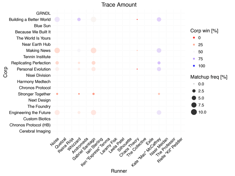
This first preliminary graph that shows a global view of the meta over time, i.e. changes with each new release (from Trace Amount to The Source):
- Each frame is a snap shot of the meta for a specific RELEASE (indicated in
the title) of all players on OCTGN. - Each column is a single RUNNER.
- Each row is a single CORP.
- Each circle represents the specific matchup between the runner and the corp
of the intersection (e.g. NEH vs. Andromeda). - The size of each circle indicates MATCHUP FREQUENCY during a specific release (i.e number of games of a specific matchup divided by total number of games).
- The color of each circle represents the CORP WIN RATE of that matchup during a specific release, with light grey representing 50% (i.e split), shades of blue > 50%
(i.e. favorably for corp), and shades of red a corp win rate < 50% (i.e.
favorably for runner).
Here some general guidelines on how to interpret the graph:
- If a lot of circles in a single row are large then the corresponding corp is
popular. - If a lot of circles in a single row are blue then the corp is successful.
- Correspondingly, large, red circles in a single column indicate a popular and
succesful runner. - If a lot of circles in all rows and columns are blue then corps dominate
the meta, if red then runners.
Some stray observations:
- Newly released IDs are initally popular.
- Notice how the “Stronger Together” row is mostly red? Always.
- The meta drastically shifts blue when Honor and Profit is released.
- After its release, NEH surges while MN and TWIY decline.
The next goals for further analysis are:
- Getting data for later releases.
- Implement interactive graphs (e.g. a slider to manually switch between releases, look only at the top 25% of players).
What trends and patterns do you see in the data? What parameters would you like to explore? Please let me know any feedback in the comments!
UPDATE: Here an interactive version of the graph.
UPDATE #2: The interactive version now also contains a table view of the data that can be sorted and searched.